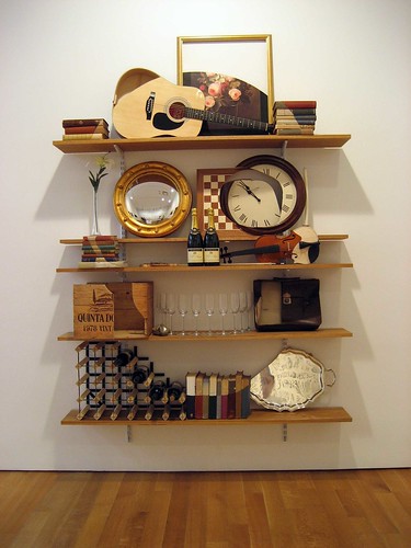
James Hopkins, Consumption and Consequence, 2006
This was one of my favorite pieces in a smart group show at James Cohan Gallery titled A Brighter Day.
Related: Click opera on shelves and art. While you're there, check out his excellent post on the White House's purposefully middlebrow (at best) graphic design. It's dirt style without the irony!


One of our favorites, as well. Wry and elegant.